
Orders and shipments at
JSW One.
A B2B steel marketplace sent buyers from cart straight to payment. I made the order a persistent object, then made everything that happens to it visible, on desktop and on a phone at the site.
- 2% → 28%Cart-to-order conversion
- 1000+MSME buyers served
- 1000+Weekly B2B steel deliveries
My role
Sole designer on a live B2B system, from research to final screens.
The buyers were procurement managers, site engineers and business owners committing lakhs of rupees at a time. I owned the research, the information architecture and every screen, for desktop and mobile.
- 01
Research
Who the buyer really is, and how mature marketplaces structure an order after checkout.
- Research and competitive analysis, benchmarked against Amazon’s My Orders → View Order structure
- 02
Information architecture
Order summary and shipment layer, ordered by the questions a procurement manager actually asks.
- Information architecture for the order summary and the shipment visibility layer
- 03
Design and scoping
Wireframes and final screens, and the arguments about what belonged where.
- Wireframes and final screens, desktop and mobile
- Scoping arguments with stakeholders on what belonged in the downloadable PDF
- Worked with
- The product manager and the CPO
- Scope
- Post-cart layer: order, payment state, ledger and fulfillment visibility
- Status
- Shipped, in two releases, Jun to Sep 2023
Impact
Cart-to-order conversion
2% → 28%
Once the order existed before the payment.
MSME buyers served
1000+
Procurement teams across India.
Weekly B2B steel deliveries
1000+
Each one now trackable without a phone call.
Who is the buyer, really?
Not a shopper. A procurement manager with a ₹50 lakh budget.
The problem
The buyer isn’t a shopper.
MSME buyers manage multi-SKU orders, ledger balances, advance payments and freight. The checkout didn’t reflect any of that: click “place order”, land on a payment page, and decide about a ₹5 lakh order with almost no information visible.
- 01
No context before paying
Buyers hit payment with incomplete context and backed out to check details they couldn’t see. By the time they came back, the moment was gone.
- 02
No order to come back to
B2B approvals take time, but a placed order wasn’t accessible anywhere useful for someone returning to pay later.
- 03
Silence after payment
Once money moved, buyers couldn’t see what was dispatched, on which truck, or when it would arrive. They called operations instead.
When should the order exist?
Before the money does.
The core decision
The order exists before the money does.
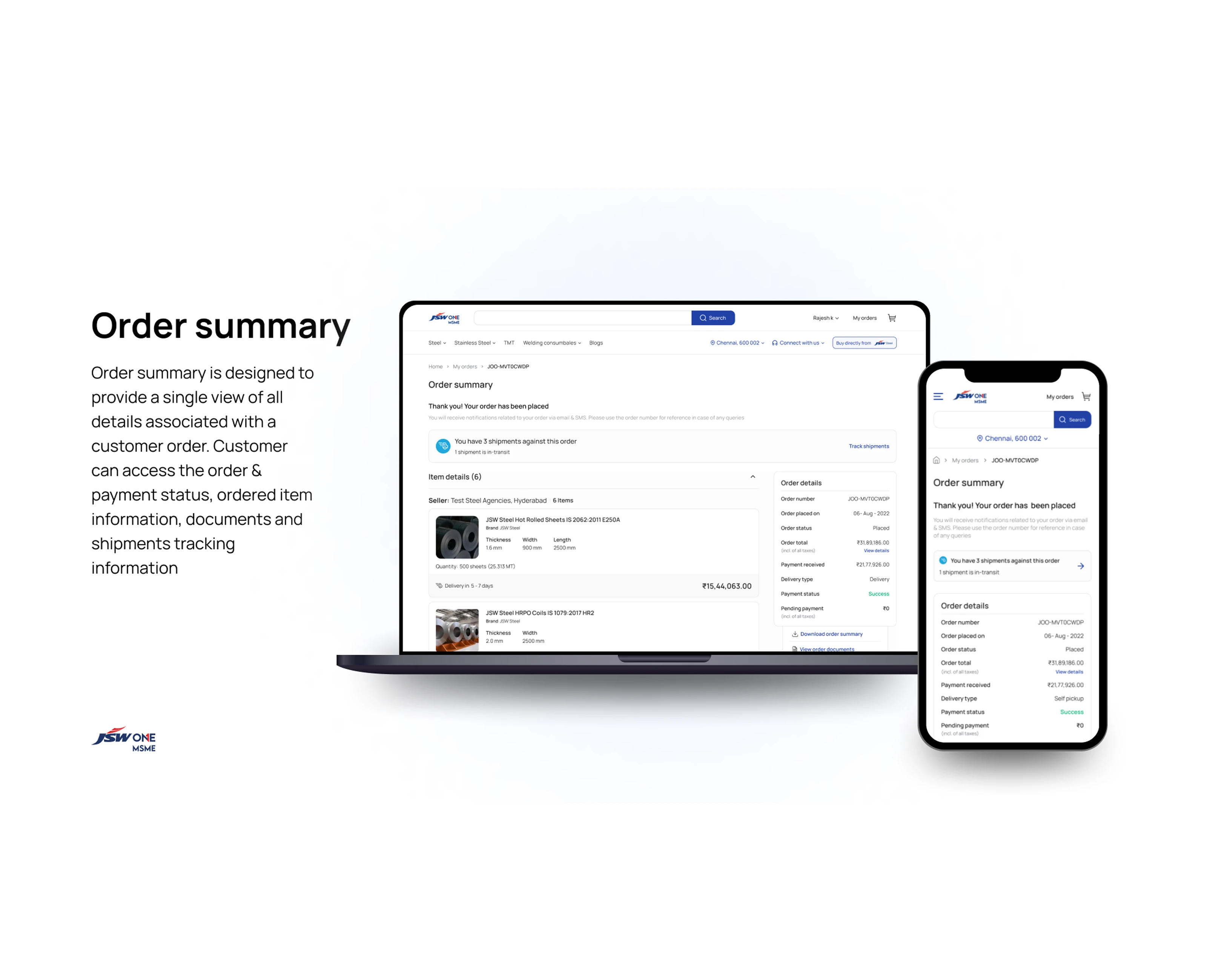
I inserted an order summary between cart and payment. After placing an order, buyers land here instead of the payment page: the order is already created, and the summary gives them complete visibility before they decide to pay. It works within JSW One’s existing design system and payment infrastructure, which couldn’t change. Only the flow leading into it could.
- Cart
- Payment
- Cart
- Order summary
- Payment
one screen did this
What does the buyer need to see?
What’s shipped, what it’s worth, when it arrives.
Decision 01 · Information order
Seven modules, in the order a procurement manager asks.
Order details, seller, payment summary, payment methods, delivery, SKU details and shipment tracking. More space wouldn’t fix that. Sequence would: what did I order, who from, what do I owe, how do I pay, when does it arrive, what exactly is shipped.
Decision 02 · Ledger
Ledger balance as a first-class element.
MSMEs often carry advance payments as credit, and the original flow buried it. I surfaced the ledger balance in the payment summary and wired it to Make Payment: if the balance covers the order, the payment section hides; if it falls short, the remaining amount due is shown clearly.
Decision 03 · Payment methods
Methods inline, because each one behaves differently.
For B2B payments between ₹5,000 and ₹5,00,000, NEFT, RTGS, cheque and ledger settlement have different timelines. Showing them in the summary, next to the balance and amount due, lets buyers choose without leaving the page.
Decision 04 · Scope
I argued against putting shipment data in the PDF.
The downloadable order summary was a stakeholder request, and the instinct was to put everything in it. Shipment data changes: a PDF downloaded on day one is stale by day three, gets shared with a site manager, and someone has to explain why the delivery window is wrong.
Decision 05 · Shipment layer
Three questions, and a filter.
A single order can be 40 metric tons across several trucks, dispatch windows and invoices. I had three weeks to design the whole shipment layer, and started from what a procurement manager needs to know: what’s being shipped, what it’s worth, when it arrives. Every screen answers at least one. Two shortcuts skip the order summary entirely, because checking whether your truck left shouldn’t take three clicks.
Decision 06 · Shipment list
Every shipment against an order, in one snapshot.
Before this, buyers called ops to ask how many trucks were on the way. The list shows every planned and delivered shipment with ID, invoice value, item count, dispatch and delivery dates, with in-transit and delivered split into tabs.
Decision 07 · Shipment detail
One scrollable column, no tabs.
A buyer at a construction site needs the driver’s number, the vehicle number and the e-way bill at the same time, on a phone. The page runs top to bottom: timeline, logistics grid, dispatched items, documents, then support. Track Shipment and View Documents sit right under the timeline, where the eye lands first.
Decision 08 · Dispatched items
SKU detail down to coating grade.
Hot rolled, galvanized and TMT, in different thicknesses, widths and quantities. The table shows product, brand, specifications, quantity in metric tons and invoice value per line, with the total at the bottom.
Trade-offs · where it landed
Each screen took a side.
What the buyer needed won over what was easy to build or what a stakeholder asked for.
Small dots are what we considered. Big ones are where it landed.
Behind the work · 28 notes
The wall behind two releases.
What a procurement manager needs, what the system couldn’t change, and what I argued against.
Orders!!
- Buyers aren’t shoppers
- Cart → payment, zero context
- Order exists before payment
- Approvals take days. Pay later
- Benchmark: Amazon My Orders
- What did I order?
- Who am I buying from?
Payments
- What do I owe?
- How do I pay?
- Ledger covers it → hide payment
- NEFT · RTGS · cheque · ledger
- ₹5k to ₹5L per payment
- Partial ledger coverage?
- Don’t touch the payment infra
Shipments
- No shipment data in the PDF!
- PDF is stale by day 3
- 40 MT, many trucks
- Shipped? Worth? Arriving?
- Driver no. + vehicle no.
- E-way bill, invoice no.
- In transit vs delivered
- Coating grade matters
- Skip straight to shipments
Don’t forget!
- Existing design system only
- Site manager, on a phone
- One column. No tabs
- Ops answering calls all day
- 3 weeks for the whole layer
What would I push further?
Two edge cases worth testing with real buyers.
What I’d push further
Two places the design would go next, with real procurement managers.
- 01
Ledger reconciliation edge cases
The ledger balance auto-reconciliation logic, where the payment section hides when the balance covers the order, works well for clean cases. Edge cases are messier: partial ledger coverage, credit limits and advance payment expiry. I’d want to run those scenarios with real procurement managers before calling the logic complete.
- 02
Multi-seller SKU view on mobile
The multi-seller SKU view works at the page level but gets dense on mobile for orders with 5+ sellers and 10+ SKUs. I’d explore a seller-first accordion structure for that specific scenario, collapsed by default, expanded on tap, rather than the current flat list that requires significant scrolling.
Conclusion:
What this project was really about.
Conclusion